Hello,
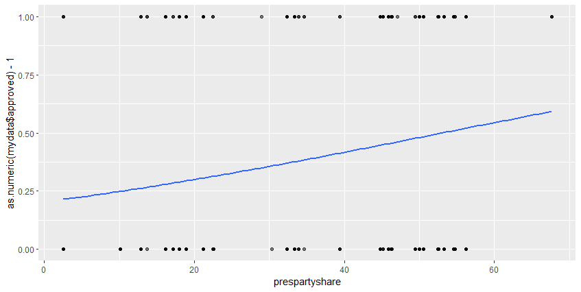
I ran a logit model, but when I try to plot it, I am having some errors. For instance, to show the distribution between two variables, I applied the GLM method in ggplot2, but instead of having the typical logistic curve, I receive a linear regression.
Here is a sample data:
mydata<-data.frame(
  prespartyshare = c(44.7470817120623,46.3035019455253,
                     16.1793372319688,16.1793372319688,17.1539961013645,
                     46.25,46.25,52.5252525252525,52.5252525252525,
                     44.7470817120623,46.3035019455253,16.1793372319688,16.1793372319688,
                     46.25,46.25),
        approved = as.factor(c("0","1","0",
                               "0","1","0","1","0","1","0","1","0","1",
                               "0","1"))
)
And the code I used:
ggplot(mydata, aes(x=prespartyshare, y=as.numeric(mydata$approved) - 1)) +
  geom_point(alpha=.5) +
  stat_smooth(method="glm", se=FALSE, method.args = list(family=binomial), fullrange=TRUE)
I appreciate your help in advance.