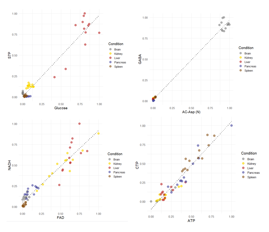
I am running a correlation analysis to find the entities in the dataset that are similar to each other.
In the next step I want to check the correlations, just to see how reliable the numbers are.
That's easy for strict linear (aka Pearson) correlation, using geom_smooth(method = "lm), however is there an easy way to approximate or show the outcome of a non-linear fit, e.g. Spearman or Kendall.
Using loess with a wide span?
Toy example:
cor(mtcars$disp, mtcars$mpg) # default is pearson
# [1] -0.8475514

cor(mtcars$disp, mtcars$mpg, method = "spearman")
# [1] -0.9088824

cor(mtcars$disp, mtcars$mpg, method = "kendall")
# [1] -0.7681311


# linear fit
ggplot(mtcars,
       aes(x = disp,
           y = mpg)) +
 geom_point() +
 geom_smooth(method = "lm", se = FALSE)  # linear fit is equivalent to pearson correlation

# nonlinear fit - does this match spearman?
ggplot(mtcars,
       aes(x = disp,
           y = mpg)) +
  geom_point() +
  geom_smooth(method = "loess",
              span = 2,
              se = FALSE)
just my opinion ... I dont see a problem using loess to help you visualise if a trend appears to be monotonically increasing or decreasing; but I think choosing too wide a span is a potentially problem, as if when looking you ignore the points and focus on the nice blue smoothed line, with relatively wide span values you will tend to 'see' a monotonic trend; only with short(er) spans will the variability show itself and make you see evidence of non monotonicity ( that would explain a spearman correlation number closer to zero)
Indeed, loess can be complicated too, i also had some cases where it introduced a large bend to reach the upper-most points, so the loess-fit actually seemed non-monotonic.
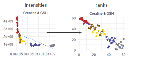
I guess we can't predict the outcome, due to the ranked nature of spearman correlation. To a given x we can eventually only predict the rank of the y (e.g. between rank 11 and 12) - however projected back on the data dimension this could still mean somewhere between let's say 50.000 and 150.000, without knowing if it's closer to the first or the latter.
I think the mathematically closest solution is to calculate the ranks and plot rank(y) vs. rank(x) that should be linear again?
So it shows at least why the spearman correlation is so good (or bad) as it is, but clearly it removes the original dimensionality. Hmm...