Lilip
February 21, 2023, 1:39pm
1
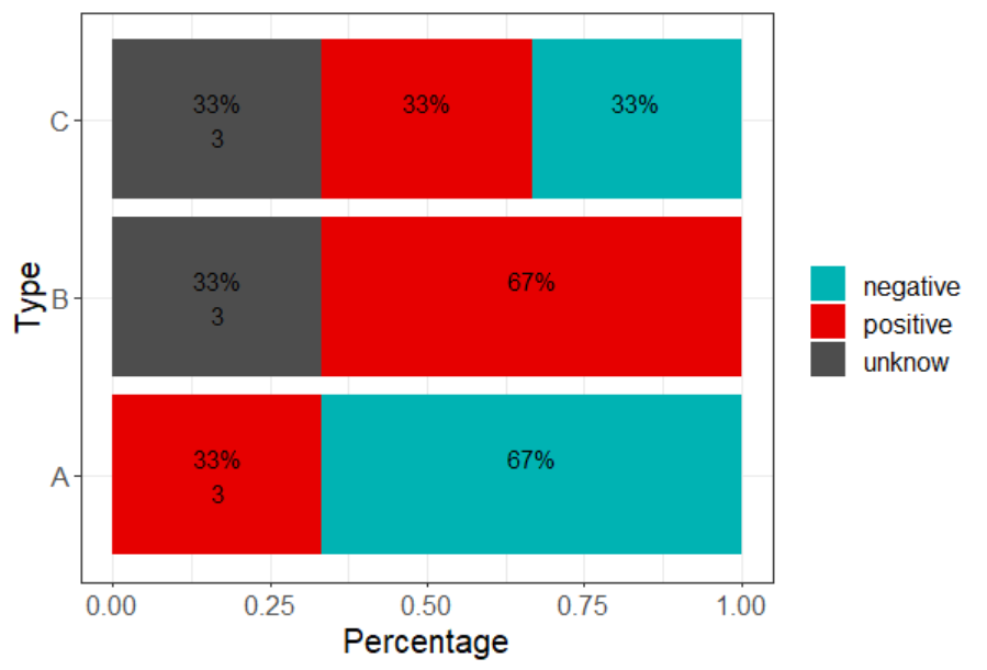
In this example graph, the count of each group (or 'type') appears three times below the percentage of each result. What I am trying to do is to show the count ('total') just once per type, and to place it to the left, below the y-label, underneath A, B, and C. Alternatively, the count could be shown to the right of the bar. Do you have any suggestions on how I can achieve this?
df <- data.frame(
  type = c("A", "A","A", "B", "B","B", "C", "C","C"),
  result = c("negative", "positive", "negative", "unknow", "positive", "positive",
            "negative","positive", "unknow" ))

myplot_a <- df %>%
  count(type, result) %>%
  group_by(type) %>%
  mutate(pct= prop.table(n) * 100,
         total = sum(n)) %>% # add a column for total count

  ggplot() + aes(y= type, pct, fill=result) +
  geom_bar(stat="identity") +
  ylab("Type") +
  labs(fill = "", x = "Percentage") +
  scale_fill_manual(values=c("negative"="#00b3b3", "unknow"="#4d4d4d", "positive"="#e60000")) +
  geom_text(aes(label=paste0(sprintf("%1.1f", pct),"%\n", total)),
            position=position_stack(vjust=0.5)) +

theme_bw()+
  theme(text = element_text(size = 15)) #font size

myplot_a
df <- data.frame(
  type = c("A", "A","A", "B", "B","B", "C", "C","C"),
  result = c("negative", "positive", "negative", "unknow", "positive", "positive",
             "negative","positive", "unknow" ))

(my_prepped_data <-  df %>%
  count(type, result) %>%
  arrange(type,desc(result)) %>%
  group_by(type) %>%
  mutate(pct= prop.table(n),
         total = sum(n) ,
  pct_text = scales::label_percent()(pct),
         ttext=ifelse(row_number()==1,
                      paste0(pct_text,"\n",total),
                      paste0(pct_text,"\n",""))))

myplot_a <- my_prepped_data%>%
  ggplot() + aes(y= type, pct, fill=result) +
  geom_bar(stat="identity") +
  ylab("Type") +
  labs(fill = "", x = "Percentage") +
  scale_fill_manual(values=c("negative"="#00b3b3", "unknow"="#4d4d4d", "positive"="#e60000")) +
  geom_text(aes(label=ttext),
            position=position_stack(vjust=0.5)) +

  theme_bw()+
  theme(text = element_text(size = 15)) #font size

myplot_a
Lilip
February 21, 2023, 2:25pm
3
Thanks!
df <- data.frame(
type = c("A", "A","A", "B", "B","B", "C", "C","C"),
result = c("negative", "positive", "negative", "unknow", "positive", "positive",
"negative","positive", "unknow" ))
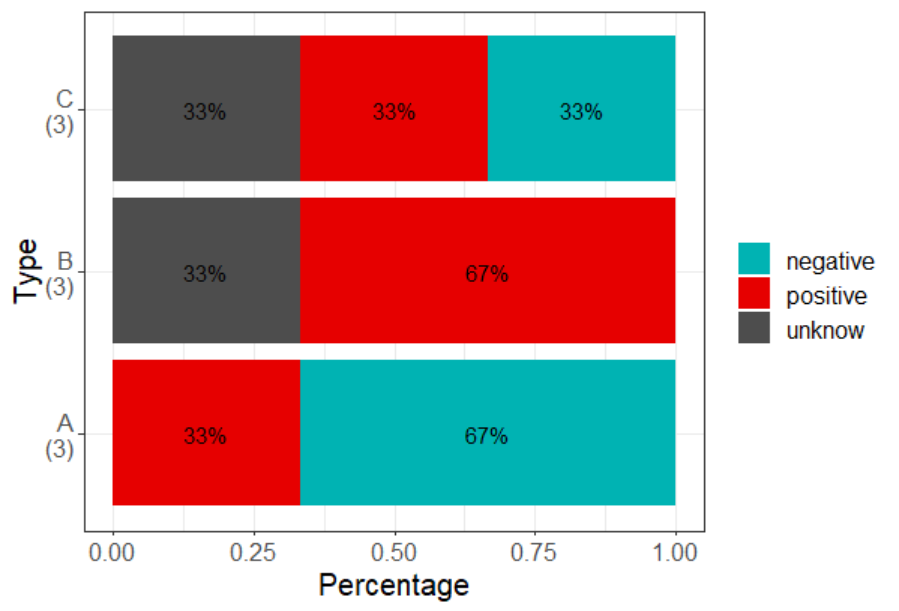
(my_prepped_data <- df %>%
count(type, result) %>%
arrange(type,desc(result)) %>%
group_by(type) %>%
mutate(pct= prop.table(n),
total = sum(n) ,
pct_text = scales::label_percent()(pct),
type=paste0(type,"\n(",total,")")
))
myplot_a <- my_prepped_data%>%
ggplot() + aes(y= type, pct, fill=result) +
geom_bar(stat="identity") +
ylab("Type") +
labs(fill = "", x = "Percentage") +
scale_fill_manual(values=c("negative"="#00b3b3", "unknow"="#4d4d4d", "positive"="#e60000")) +
geom_text(aes(label=pct_text),
position=position_stack(vjust=0.5)) +
theme_bw()+
theme(text = element_text(size = 15)) #font size
myplot_a
1 Like
system
February 28, 2023, 2:31pm
6
This topic was automatically closed 7 days after the last reply. New replies are no longer allowed.