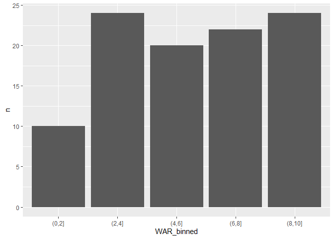
I am looking for a solution to sum values of specific ranges (e.g. 0.0-1.0, 1.1-2.0, 2.1-3.0, etc.) in a DF that then can be analyzed in ggplot.. I have the bins properly labeled in the viz the way I want them.
Code is below and resulting ggplot viz which is not correct and displayed sums individually:
WAR21_labels = WAR21 %>%
count(WAR)```
How can I sum specific ranges instead of just totals? I need to fix this issue in the code chunk above before executing any ggplot viz. My viz is close but has unique instances listed all over the place.
```getwd()
library(ggplot2)
library(dplyr)
library(base)
library(dplyr)
library(tidyverse)
WAR <- read.csv("WAR.csv")
View(WAR)
## Only Pitchers displayed in a DF
pitchers <- filter(WAR, Type == "Pitcher")
View(pitchers)
##2020 pitchers only
pitchers20 <- filter(pitchers, year == 2020)
View(pitchers20)
##2021 pitchers only
pitchers21 <- filter(pitchers, year == 2021)
View(pitchers21)
##Only Hitters displayed in a DF
hitters <- filter(WAR, Type == "Hitter")
##2020 hitters only
hitters20 <- filter(hitters, year == 2020)
##2021 hitters only
hitters21 <- filter(hitters, year == 2021)
##2020 all WAR
WAR20 <- filter (WAR, year ==2020)
#2021 all WAR
WAR21 <- filter( WAR, year == 2021)
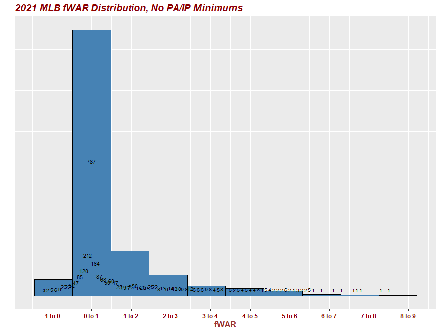
#2021 WAR histogram with custom bins and scales
ggplot(WAR21, aes(x=WAR))+
geom_histogram(fill='steelblue', col='black', bins=12)+
labs(title = "2021 MLB fWAR Distribution, No PA/IP Minimums")+
scale_x_continuous(breaks = seq(-2.,8.5, by = 1.00))+
ylab ("NA dont want a Y axis")+
xlab("fWAR")+
theme(axis.title.y = element_text(color="#993333", size=13, face="bold"))+
theme(axis.title.x = element_text(color="#993333", size=13, face="bold"))+
theme(plot.title = element_text(color="Dark Red", size=14, face="bold.italic"))+
theme(axis.text.x = element_text(color = "dark red", size = 9, face ="bold"))
##editing this and testing below
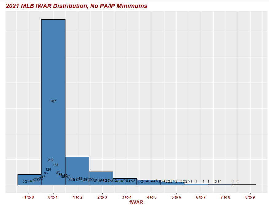
#Summary counts of the datasets
WAR21_labels = WAR21 %>%
count(WAR)
ggplot(WAR21, aes(x=WAR))+
geom_histogram(fill='steelblue', col='black', bins=10)+
geom_text(data = WAR21_labels, aes(x = WAR, y = n, label = n), vjust =-0.8, size = 3) +
labs(title = "2021 MLB fWAR Distribution, No PA/IP Minimums")+
scale_x_continuous(breaks = seq(-2.0, 8.5, by = 1.0),
# updating bin labels (same length as breaks)
labels = c('-2 to -1', '-1 to 0', '0 to 1', '1 to 2', '2 to 3', '3 to 4', '4 to 5', '5 to 6', '6 to 7', '7 to 8', '8 to 9'))+
ylab ("")+
xlab("fWAR")+
# updating to removes y-axis counts and ticks
theme(axis.text.y = element_blank()) +
theme(axis.ticks.y = element_blank()) +
theme(axis.title.y = element_text(color="#993333", size=13, face="bold"))+
theme(axis.title.x = element_text(color="#993333", size=13, face="bold"))+
theme(plot.title = element_text(color="Dark Red", size=14, face="bold.italic"))+
theme(axis.text.x = element_text(color = "dark red", size = 9, face ="bold"))