Hi,
Please can somebody help me visualise the results from measurements similar to those in this picture? I need to have a picture with the median Q1 Q3. Thanks a lot.

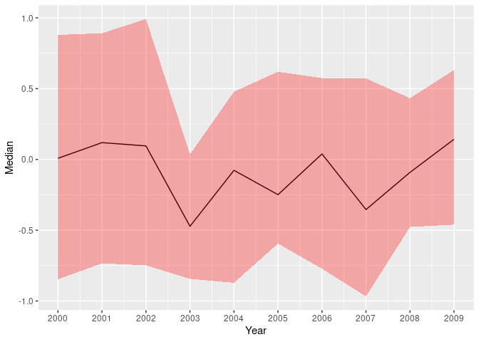
Here is a rough version of how to make such a plot.
library(ggplot2)
library(dplyr)
#>
#> Attaching package: 'dplyr'
#> The following objects are masked from 'package:stats':
#>
#>     filter, lag
#> The following objects are masked from 'package:base':
#>
#>     intersect, setdiff, setequal, union
DF <- data.frame(Year = rep(2000:2009, each = 30),
                 Value = rnorm(300))

DFstats <- DF |> group_by(Year) |>
  summarize(Median = median(Value), Q25 = quantile(Value, probs = 0.25), Q75 = quantile(Value, probs = 0.75))
DFstats
#> # A tibble: 10 × 4
#>     Year   Median    Q25    Q75
#>    <int>    <dbl>  <dbl>  <dbl>
#>  1  2000  0.00789 -0.847 0.879
#>  2  2001  0.119   -0.734 0.891
#>  3  2002  0.0952  -0.748 0.991
#>  4  2003 -0.472   -0.844 0.0352
#>  5  2004 -0.0771  -0.872 0.479
#>  6  2005 -0.249   -0.594 0.619
#>  7  2006  0.0386  -0.772 0.575
#>  8  2007 -0.354   -0.968 0.572
#>  9  2008 -0.0915  -0.477 0.432
#> 10  2009  0.142   -0.461 0.632

ggplot(DFstats, aes(x = Year)) + geom_line(aes(y = Median)) +
  geom_ribbon(aes(ymin = Q25, ymax = Q75), fill = "red", alpha = 0.3) +
  scale_x_continuous(breaks = 2000:2009)
Created on 2023-02-09 with reprex v2.0.2
This topic was automatically closed 42 days after the last reply. New replies are no longer allowed.
If you have a query related to it or one of the replies, start a new topic and refer back with a link.