Good day guys, I need help on how to create a scattered plot with a line in it to show the average
What do you mean by "average" here? A sample of your data would help (you can use dput(head(mydata, 100)) for this).
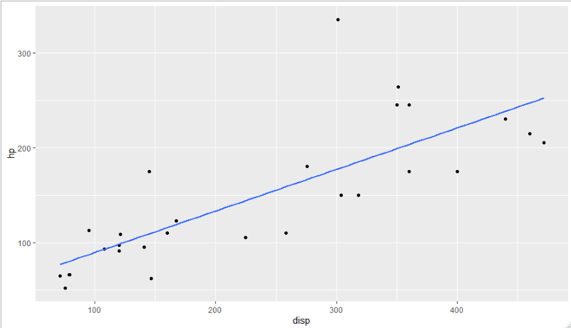
If by average you mean you just want a "trendline" of sorts, you can fit a regression line onto a scatter plot using geom_smooth:
library(tidyverse)

mtcars %>%
    ggplot(aes(x = disp, y = hp)) +
    geom_point() +
    geom_smooth(method = 'lm', se = F)
1 Like
This topic was automatically closed 21 days after the last reply. New replies are no longer allowed.
If you have a query related to it or one of the replies, start a new topic and refer back with a link.